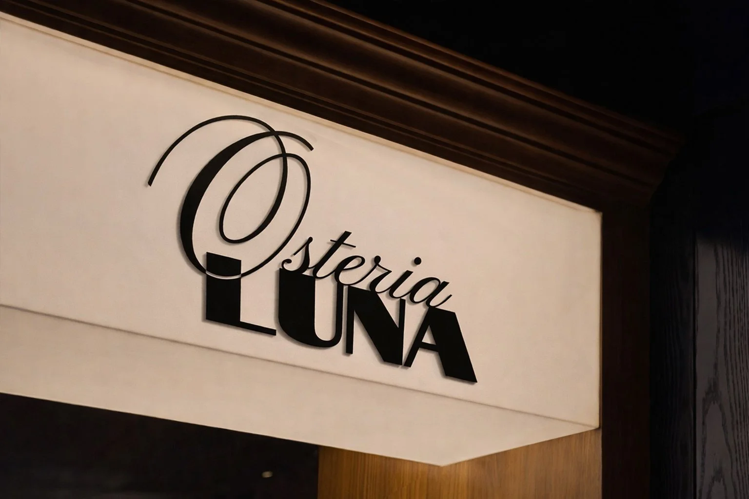
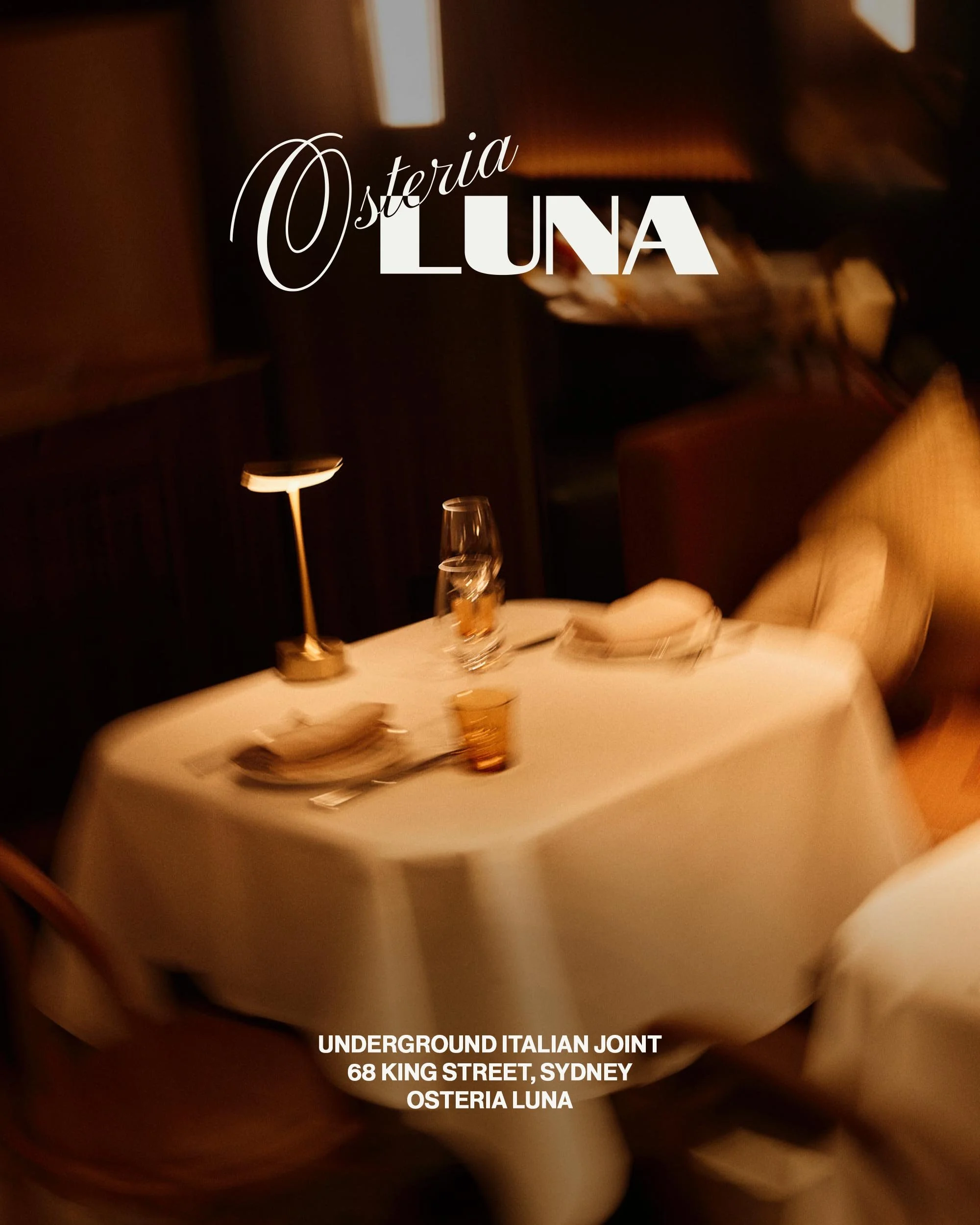
OSTERIA LUNA
Branding | Print | Art Direction
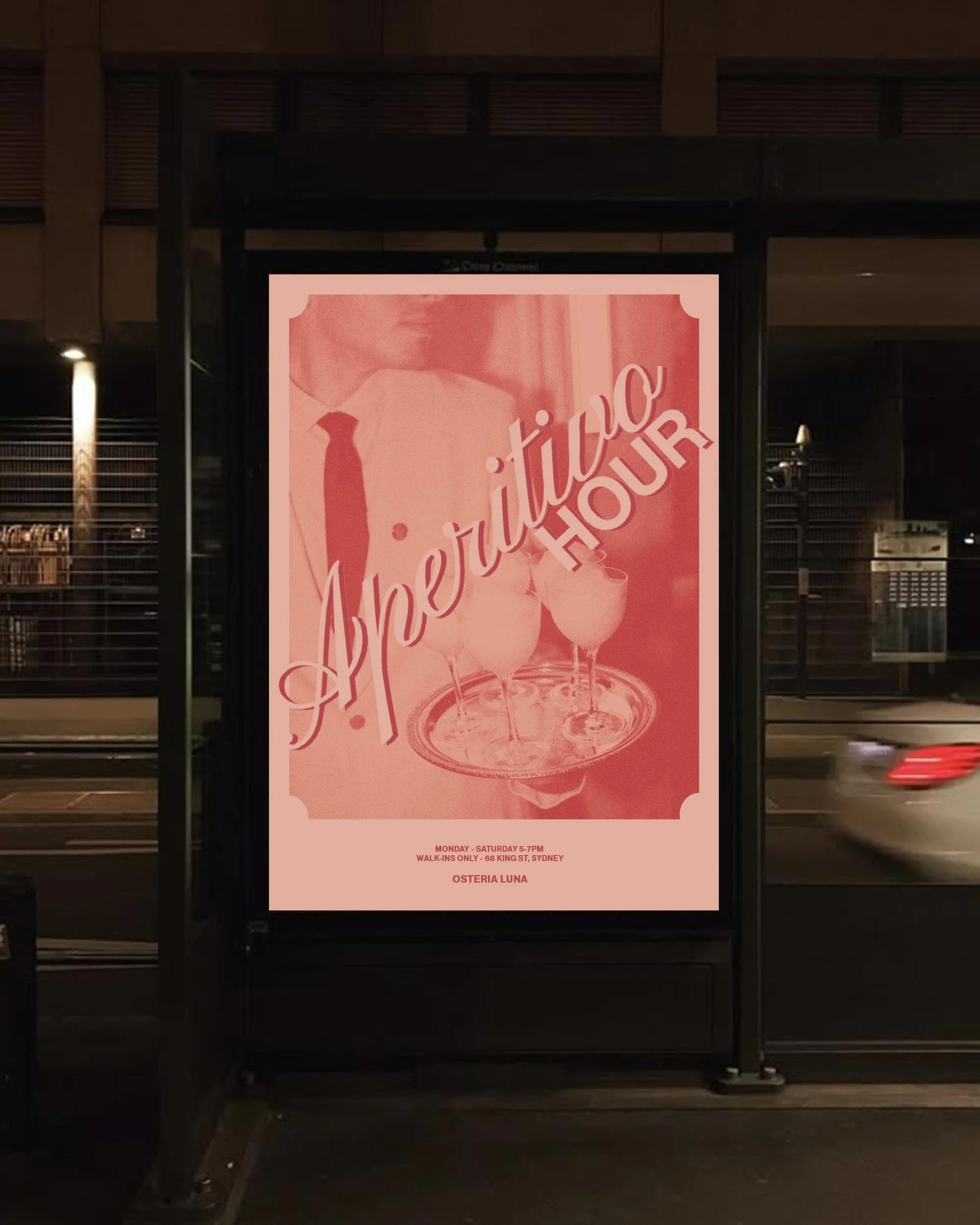
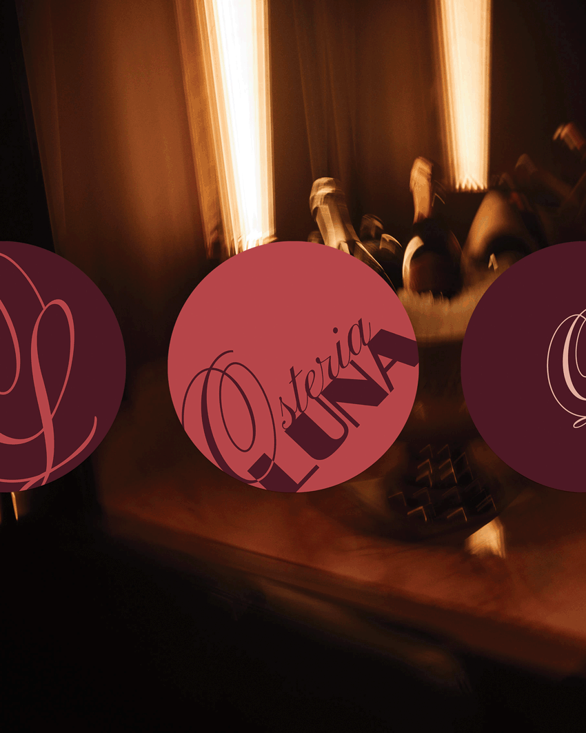
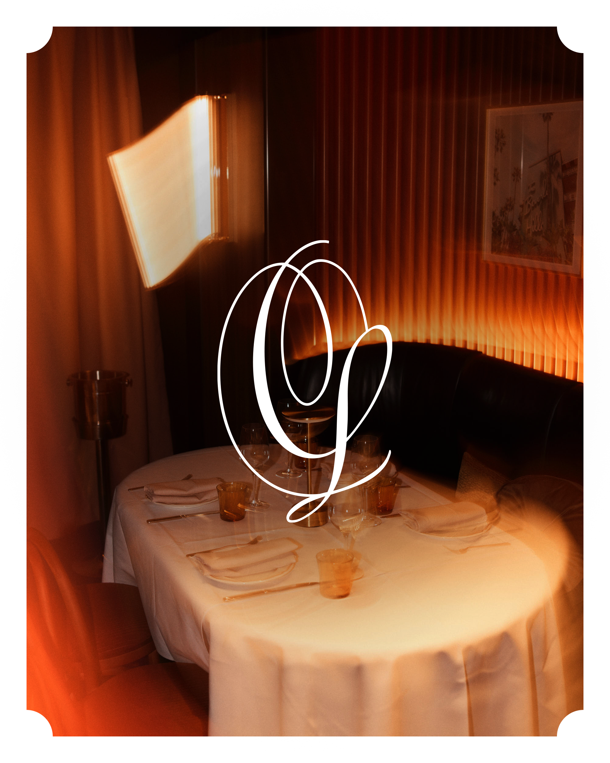
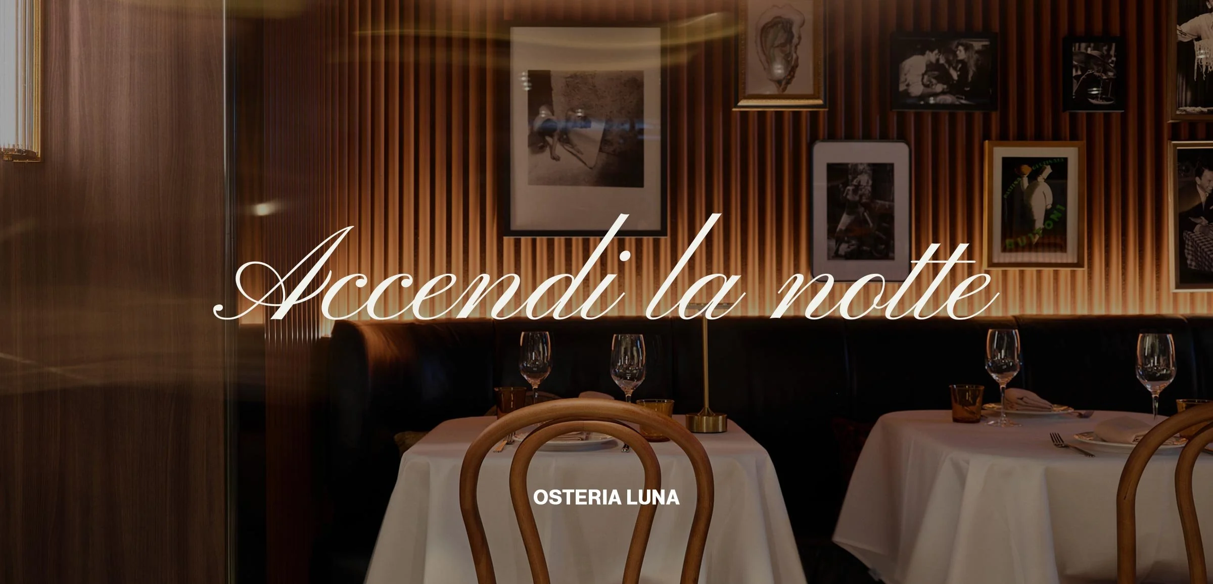
Osteria Luna is an underground Italian venue in the heart of Sydney’s CBD by Etymon Hospitality, conceived as a destination for those in the know. The brief was to create a brand that draws on Italian nostalgia without relying on it, feeling discreet, confident, and culturally fluent. I led the full brand ideation, spanning identity, monograms, iconography, and customer touchpoints. The work centred on capturing a sense of modern grandeur, as though the brand could have existed in 1950s Italy while living comfortably in the present day. Key focus areas included developing a bespoke script monogram that feels like a signature, alongside an icon inspired by an Italian hand gesture. The result is a brand that feels effortless, assured, and quietly cool.
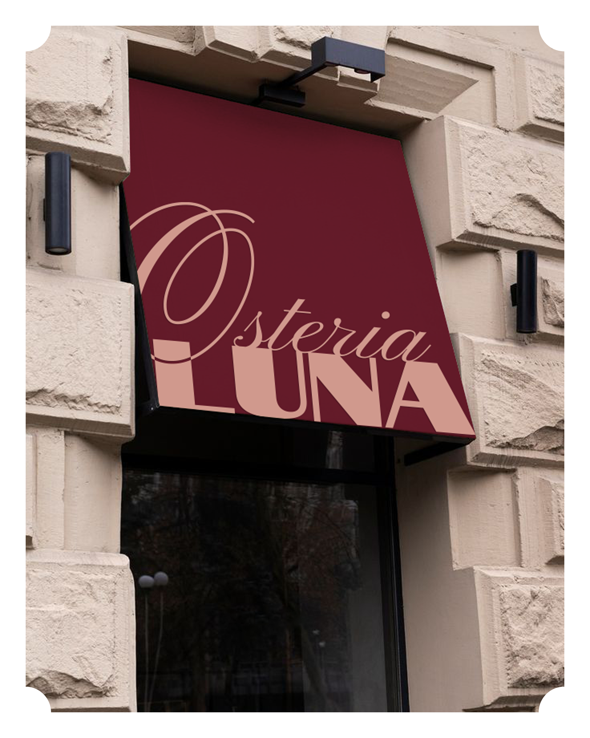
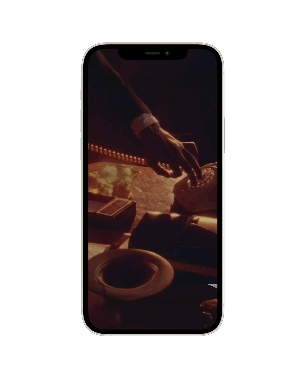
Nothing is more Italian than the pinched hand gesture. Instantly recognisable, expressive, and rooted in everyday culture. For Osteria Luna, this iconic motion became the foundation for a bespoke brand mark, drawn and refined from scratch. Stripped back to its essential form, the gesture was reinterpreted as a quiet signature rather than a literal symbol.

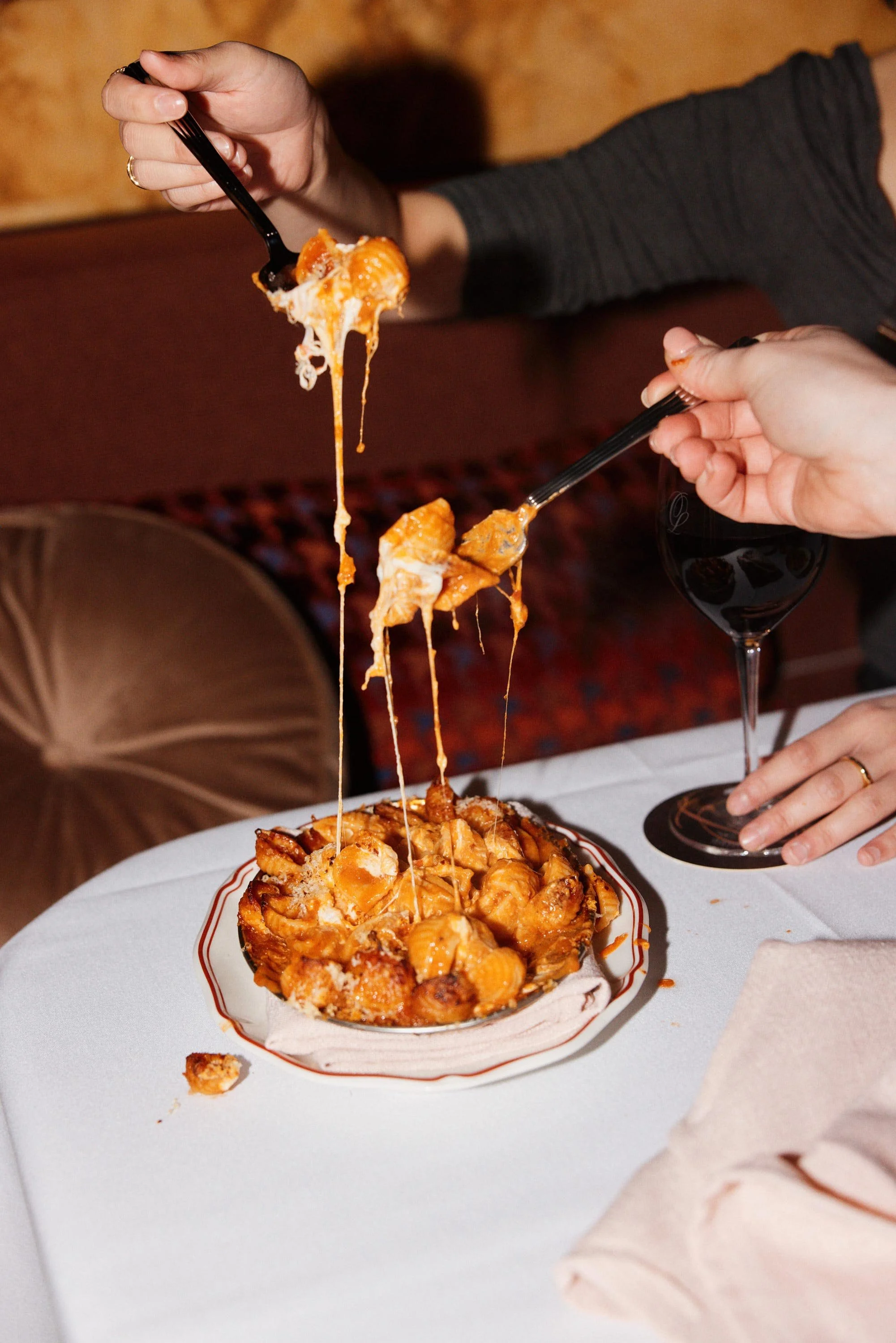


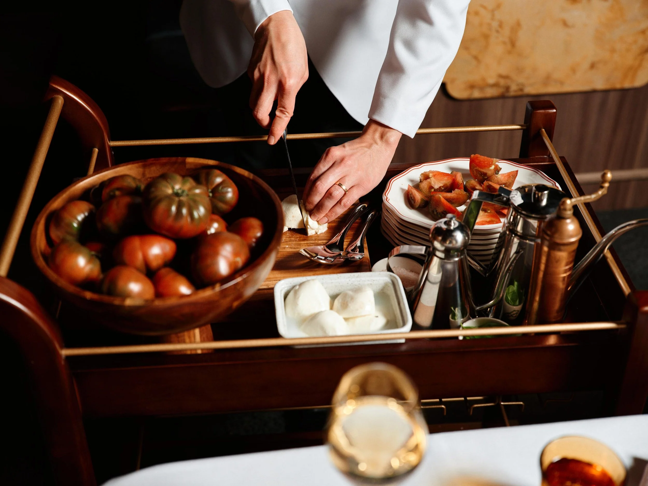
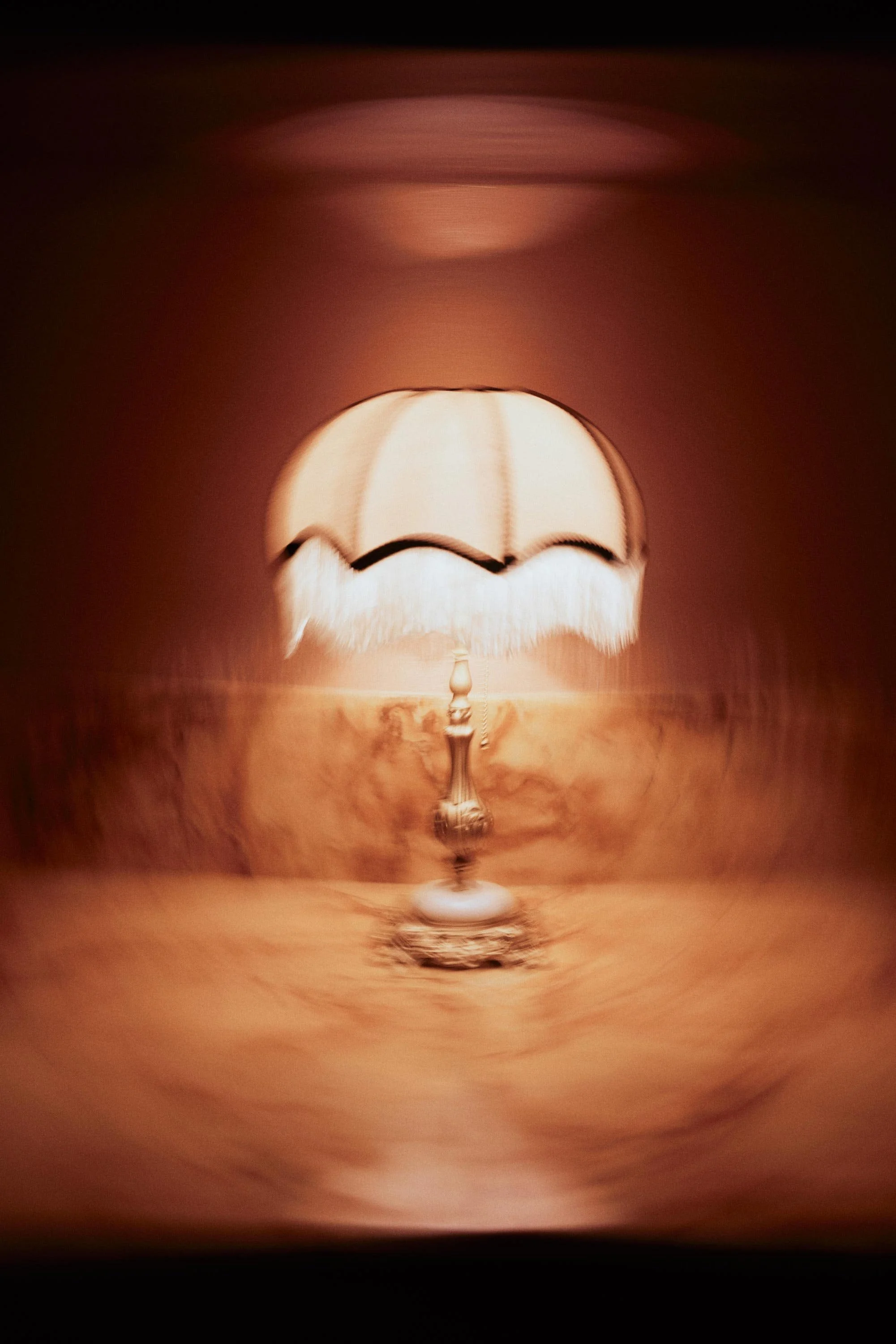

The brand world comes to life on social, where identity and photography sit in quiet conversation. Type, monograms, and iconography are paired with considered imagery to build mood, rhythm, and presence. This is where the brand is felt rather than described, allowing Osteria Luna to exist as a complete world. Confident, controlled, and unmistakably its own.
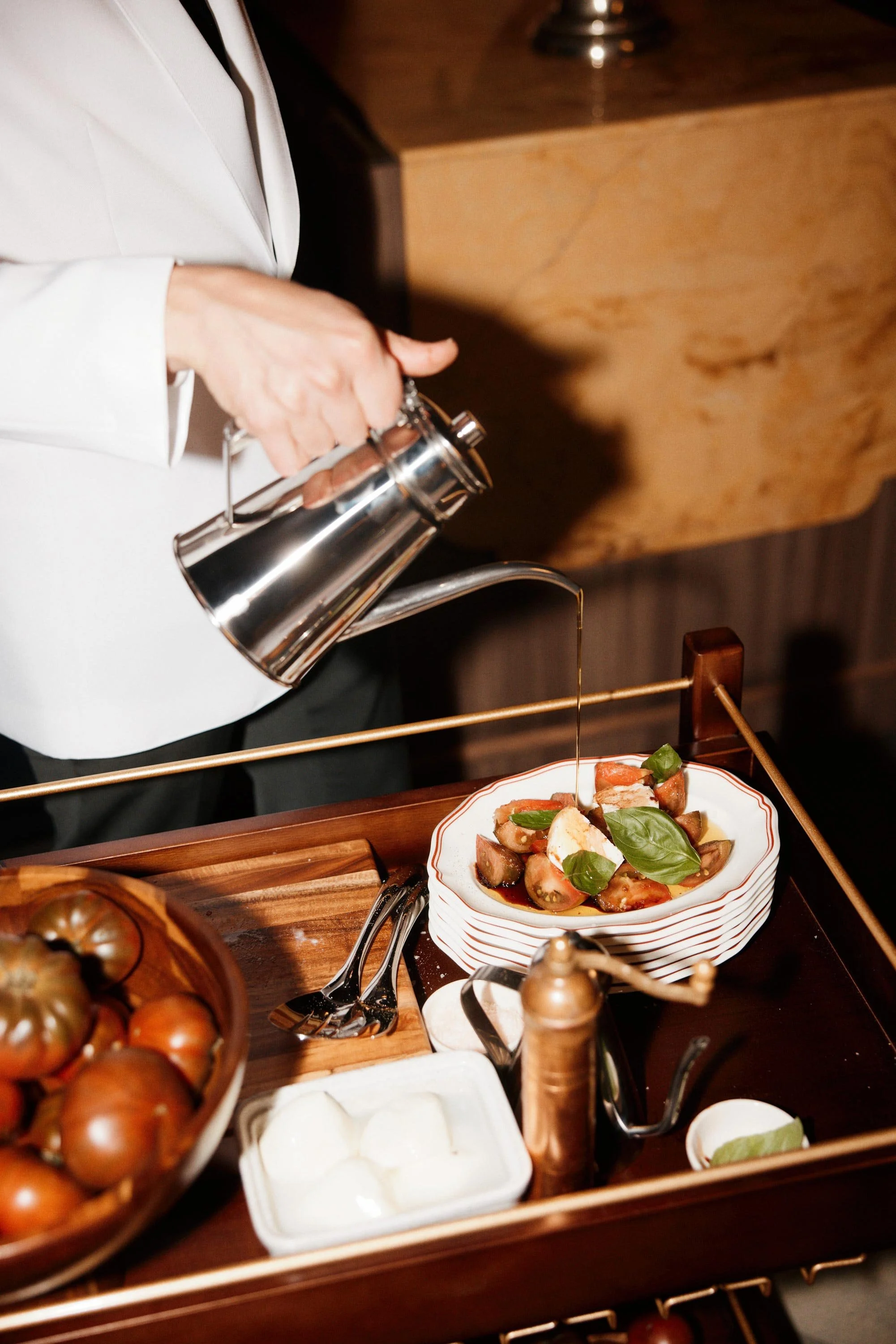
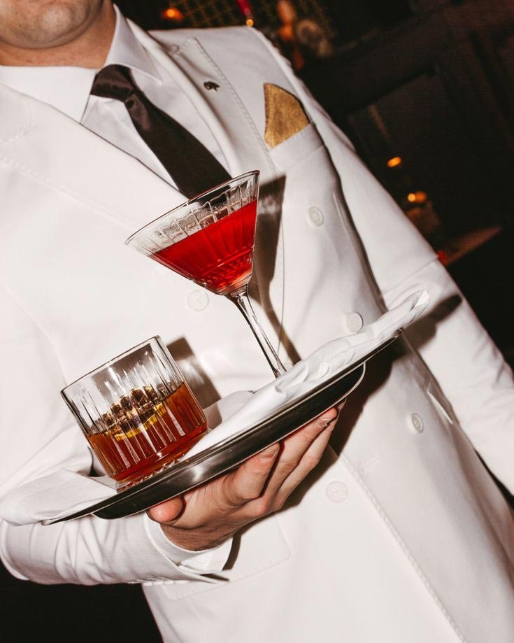

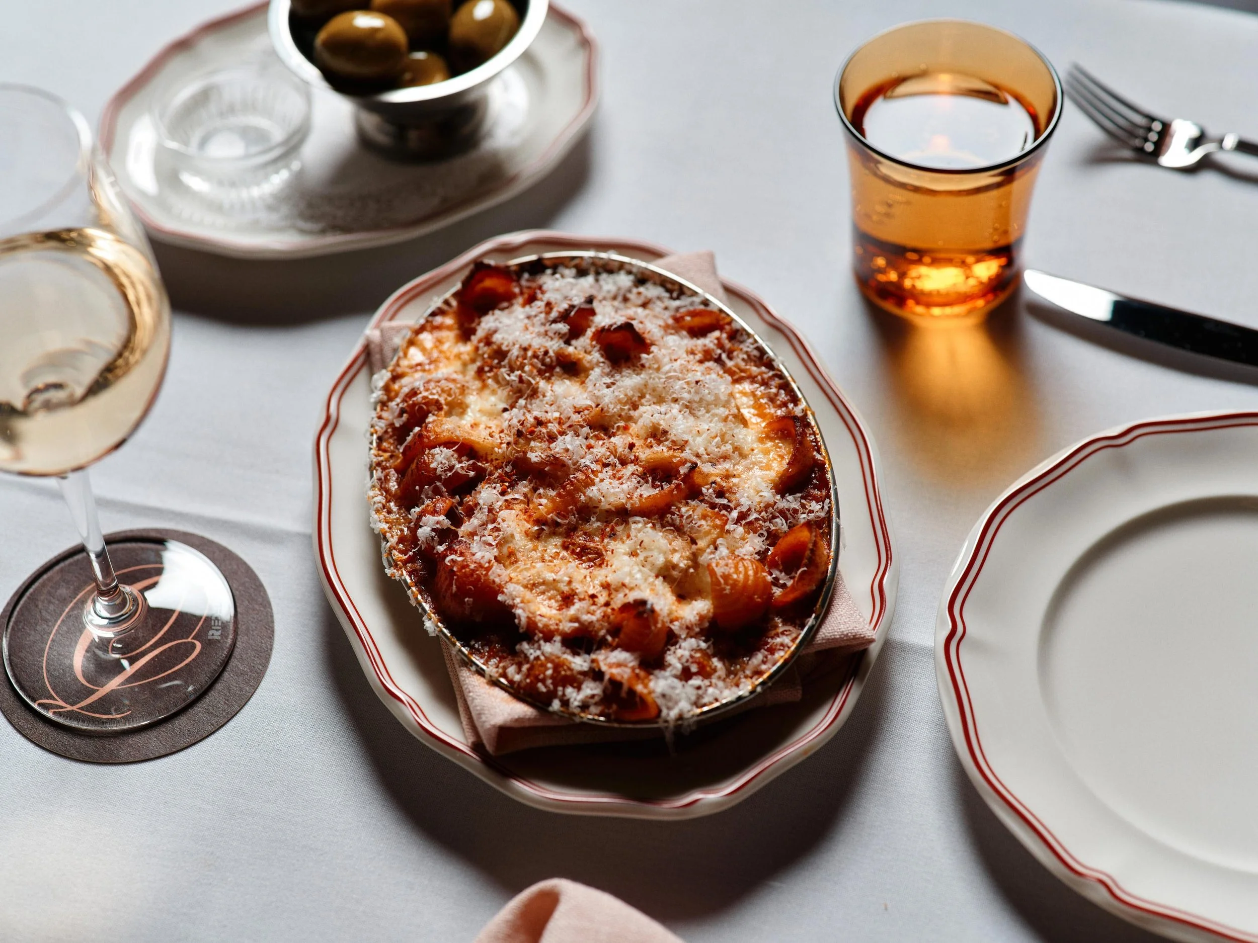

Imagery: Steven Woodburn
DISCOVER MORE