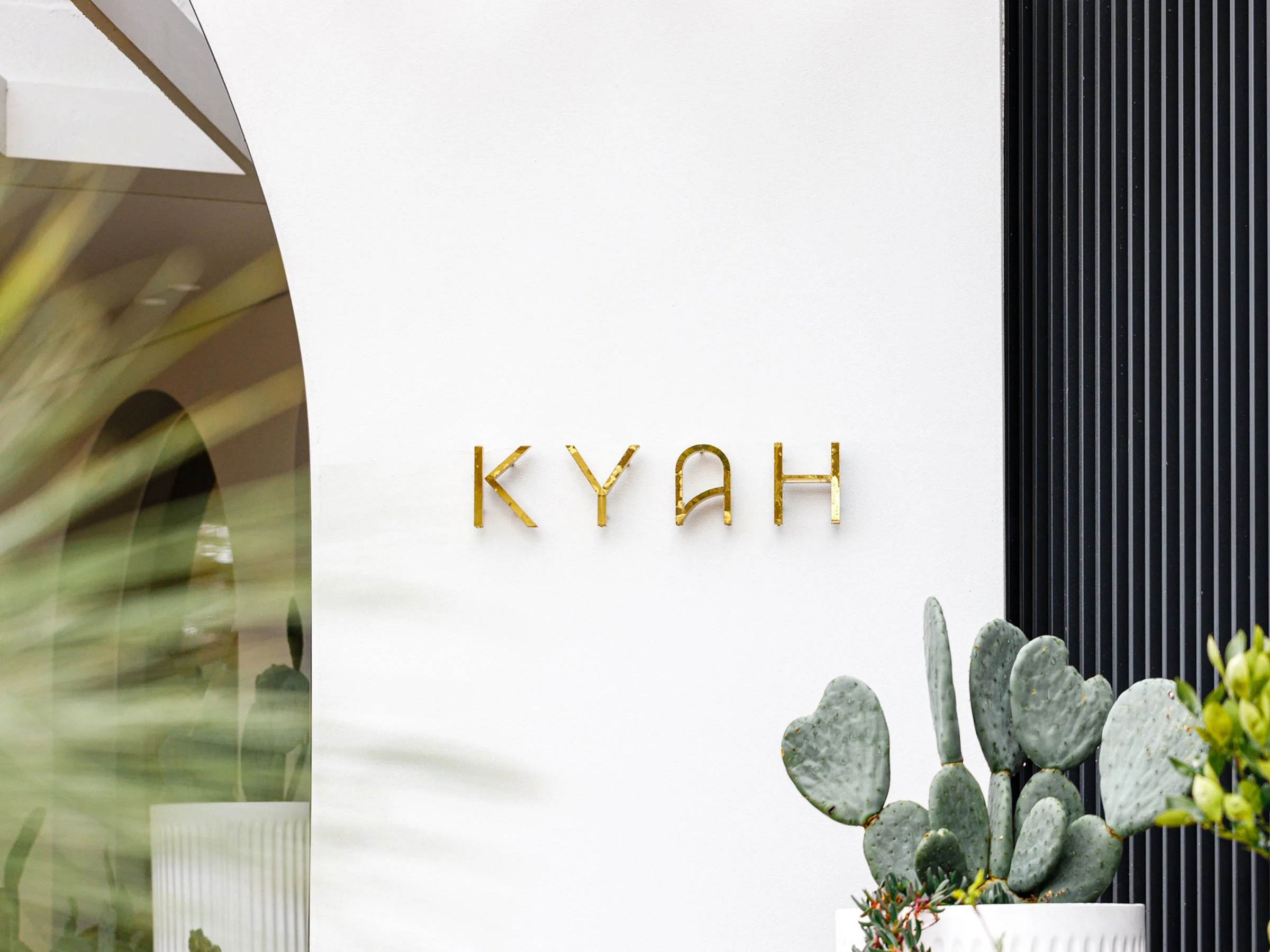
KYAH HOTEL
Branding | Print Collateral | Art Direction
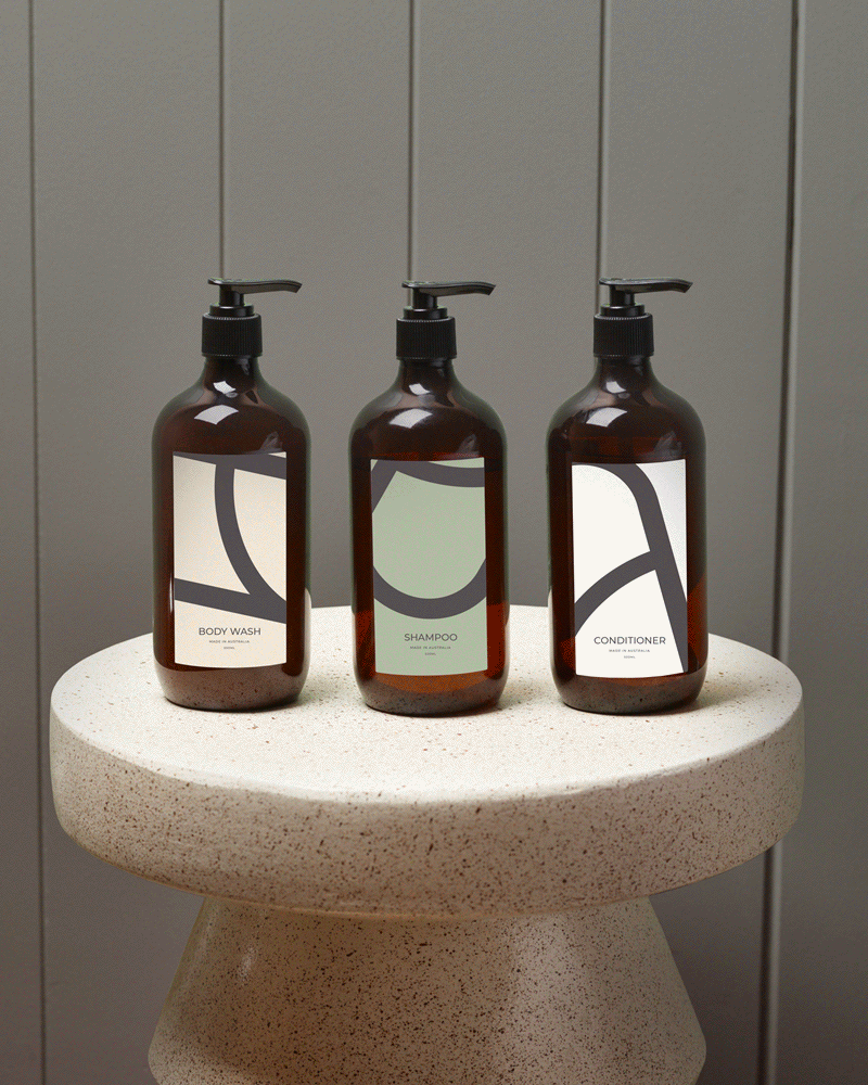
Kyah Hotel is a boutique hotel set in the Blue Mountains, reimagined through a lens of old school glamour. The brief was to evoke a sense of Palm Springs ease translated to an Australian mountain setting, balancing nostalgia with a relaxed, modern sensibility. My role centred on creating the visual language, brand identity, and digital touchpoints, shaping a system that felt warm, playful, and quietly confident without tipping into pastiche. The result is a brand expression that feels distinctive, atmospheric, and effortlessly at home in its surroundings.
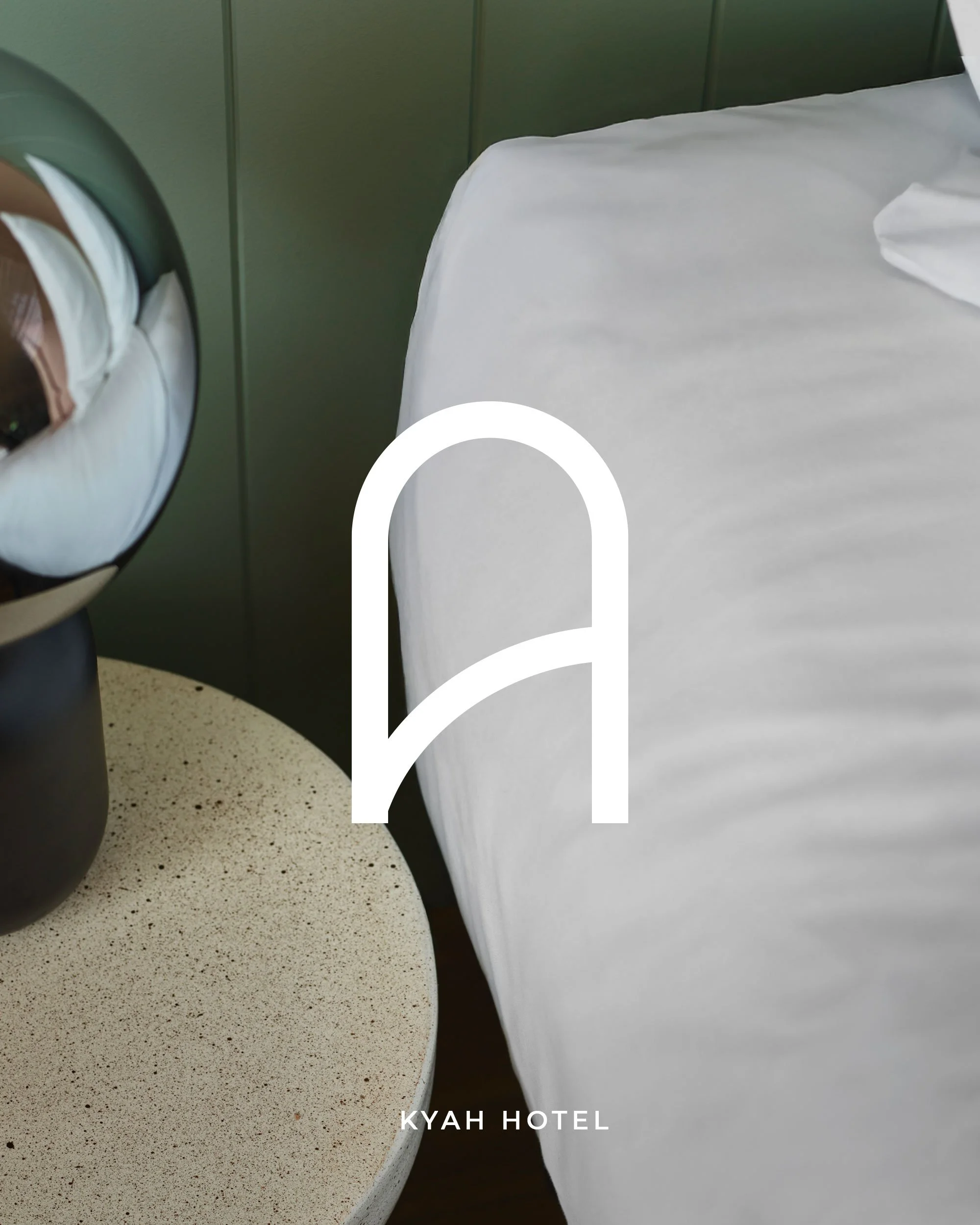
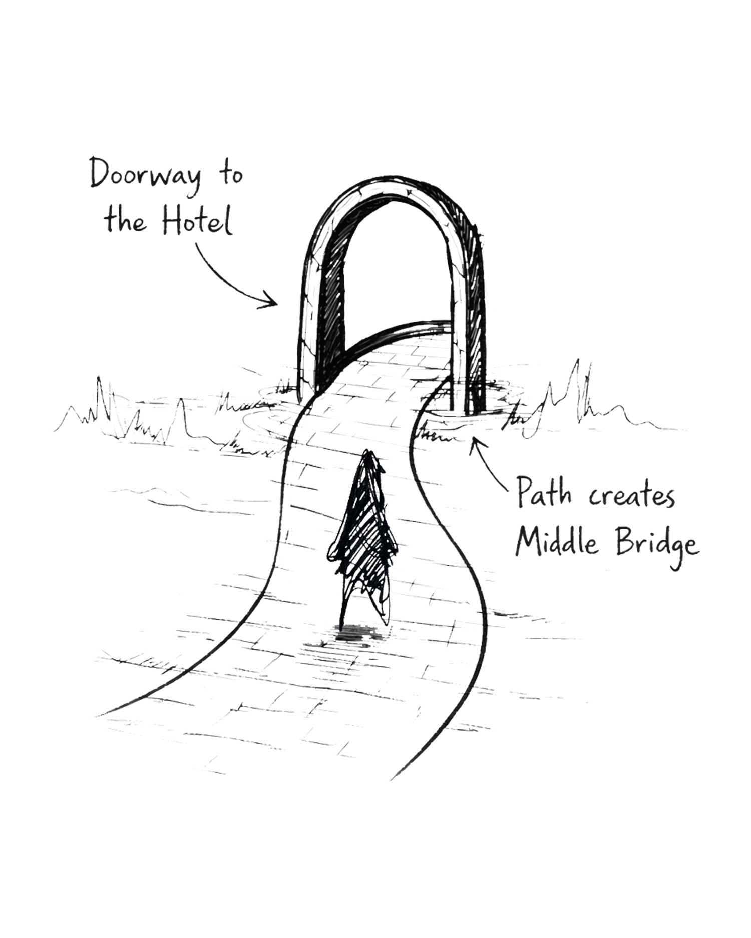
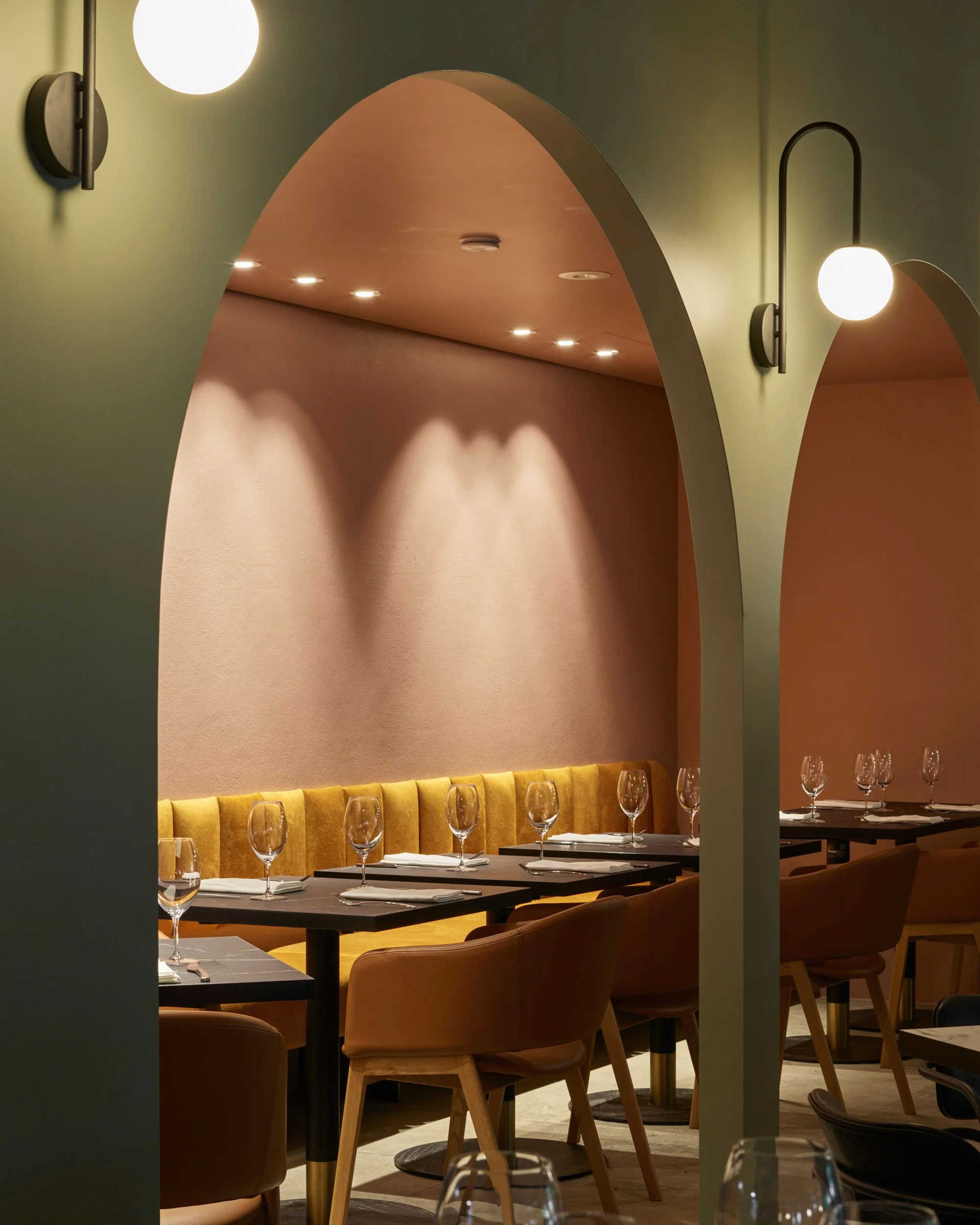
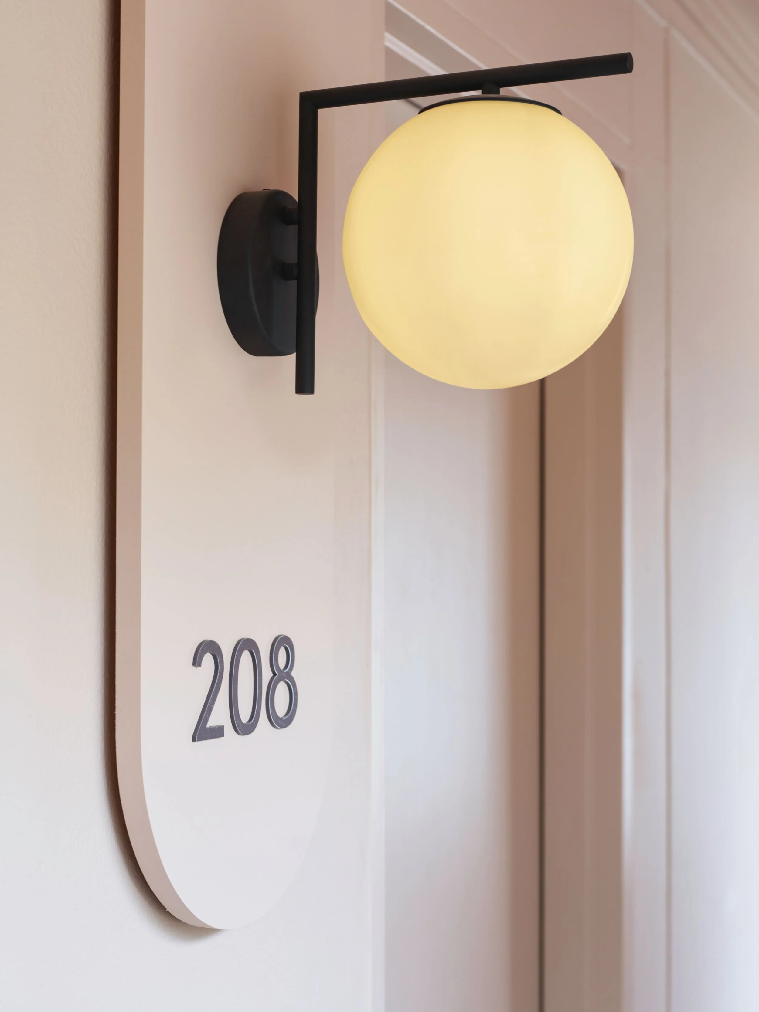
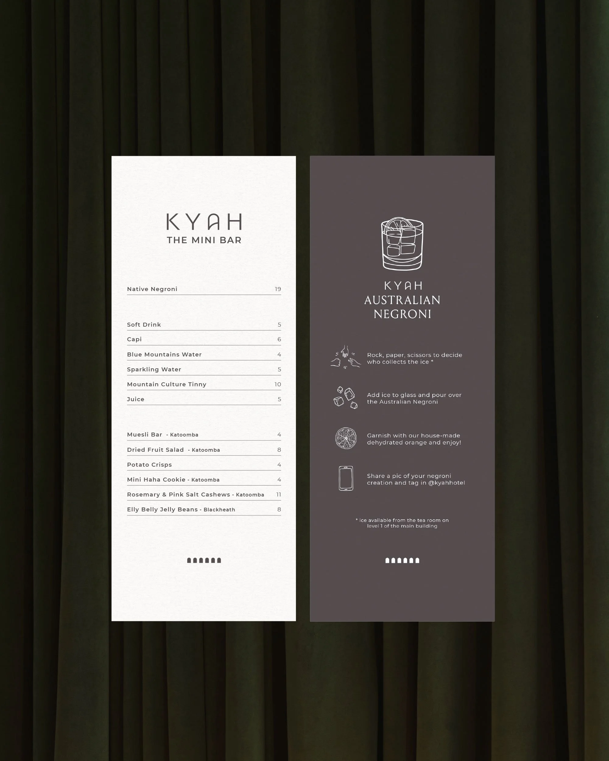
The arch is a defining gesture throughout the identity, drawn from the architecture and the experience of entering the hotel. This idea is subtly embedded into the wordmark, where the form of the letter A suggests passage rather than structure. It reads less as a letter and more as a threshold, setting the tone for a sense of transition and discovery.

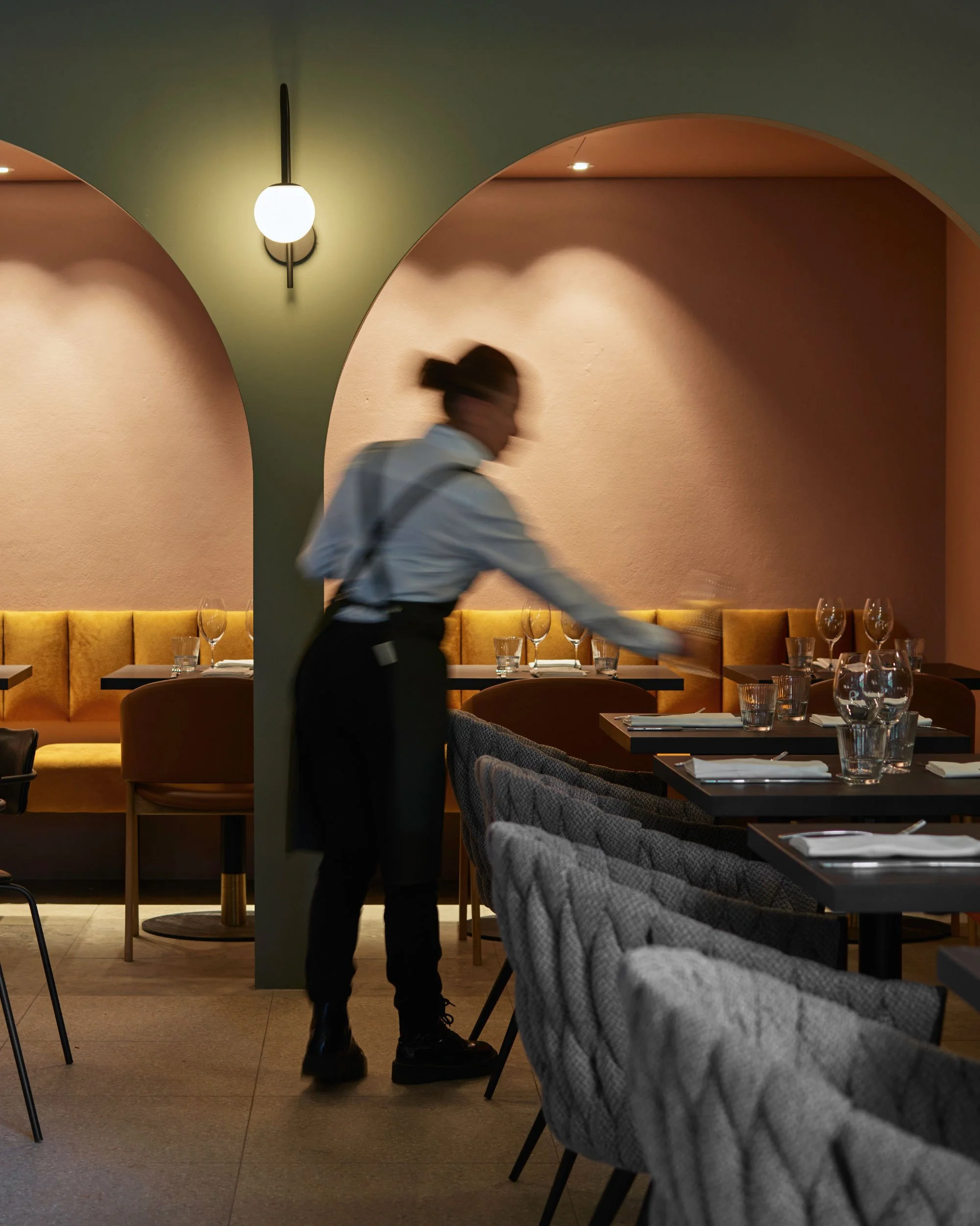
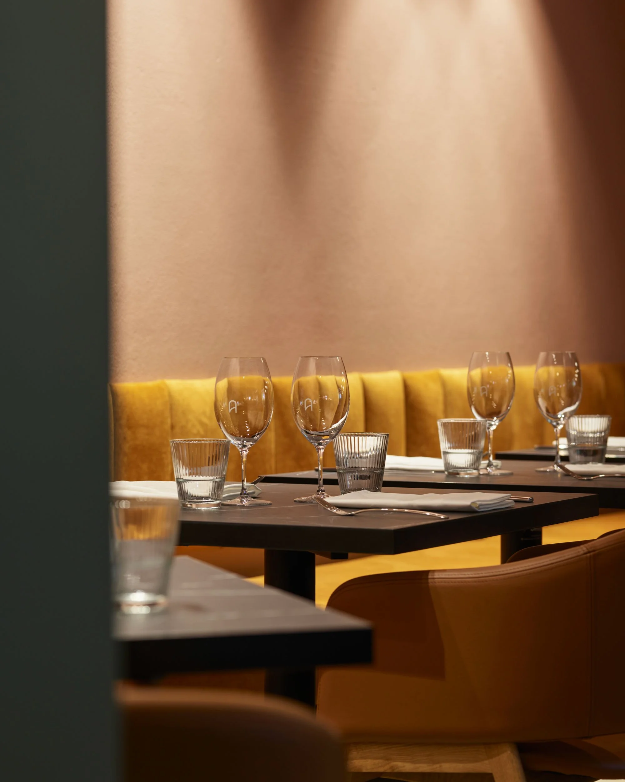
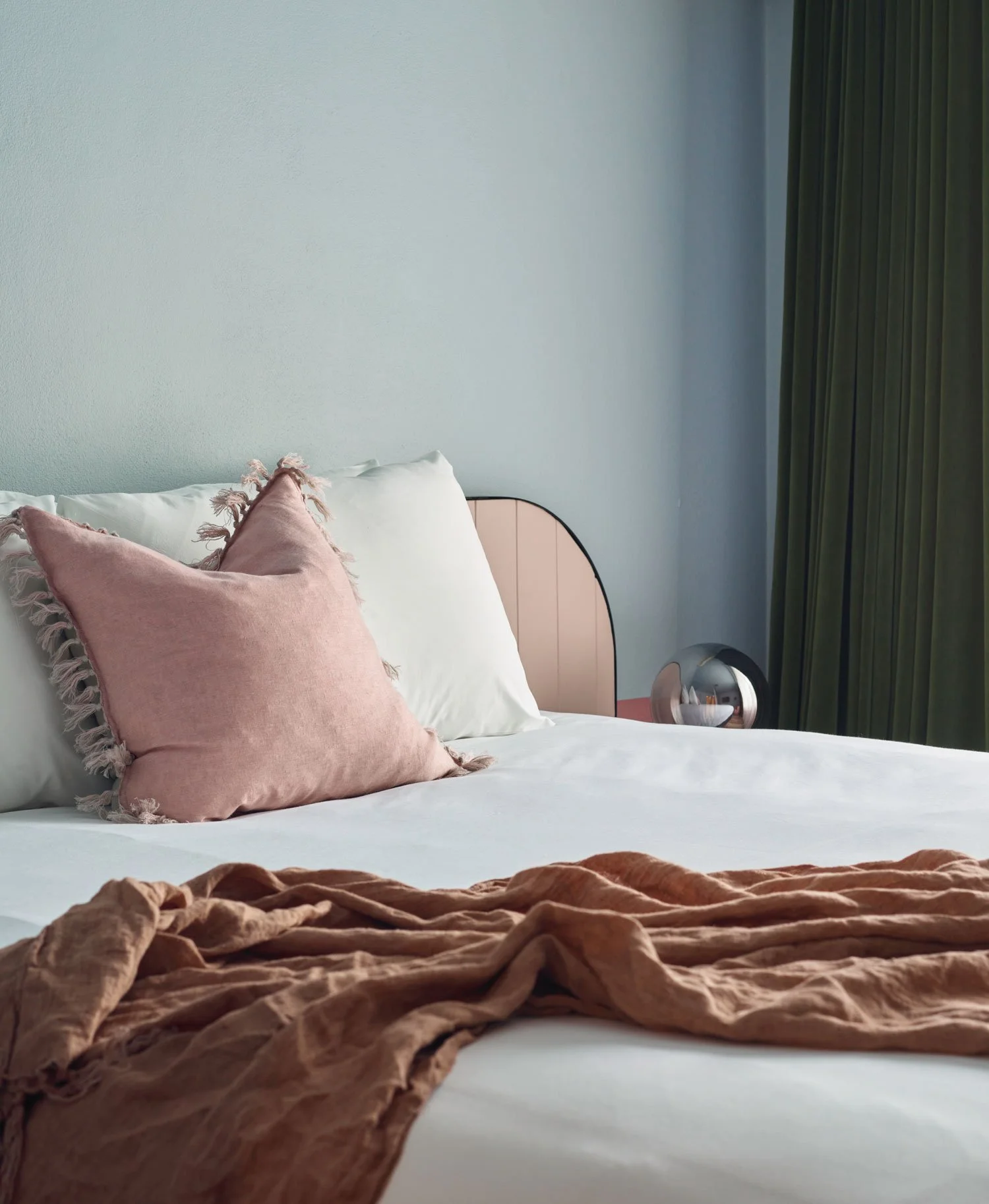
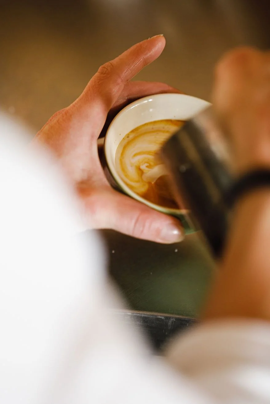
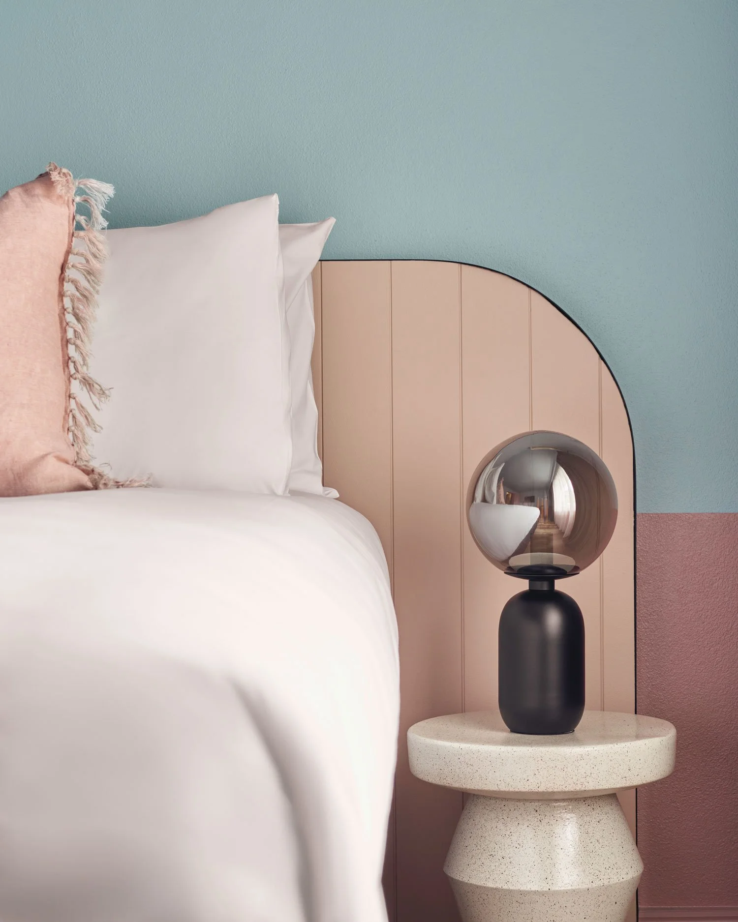
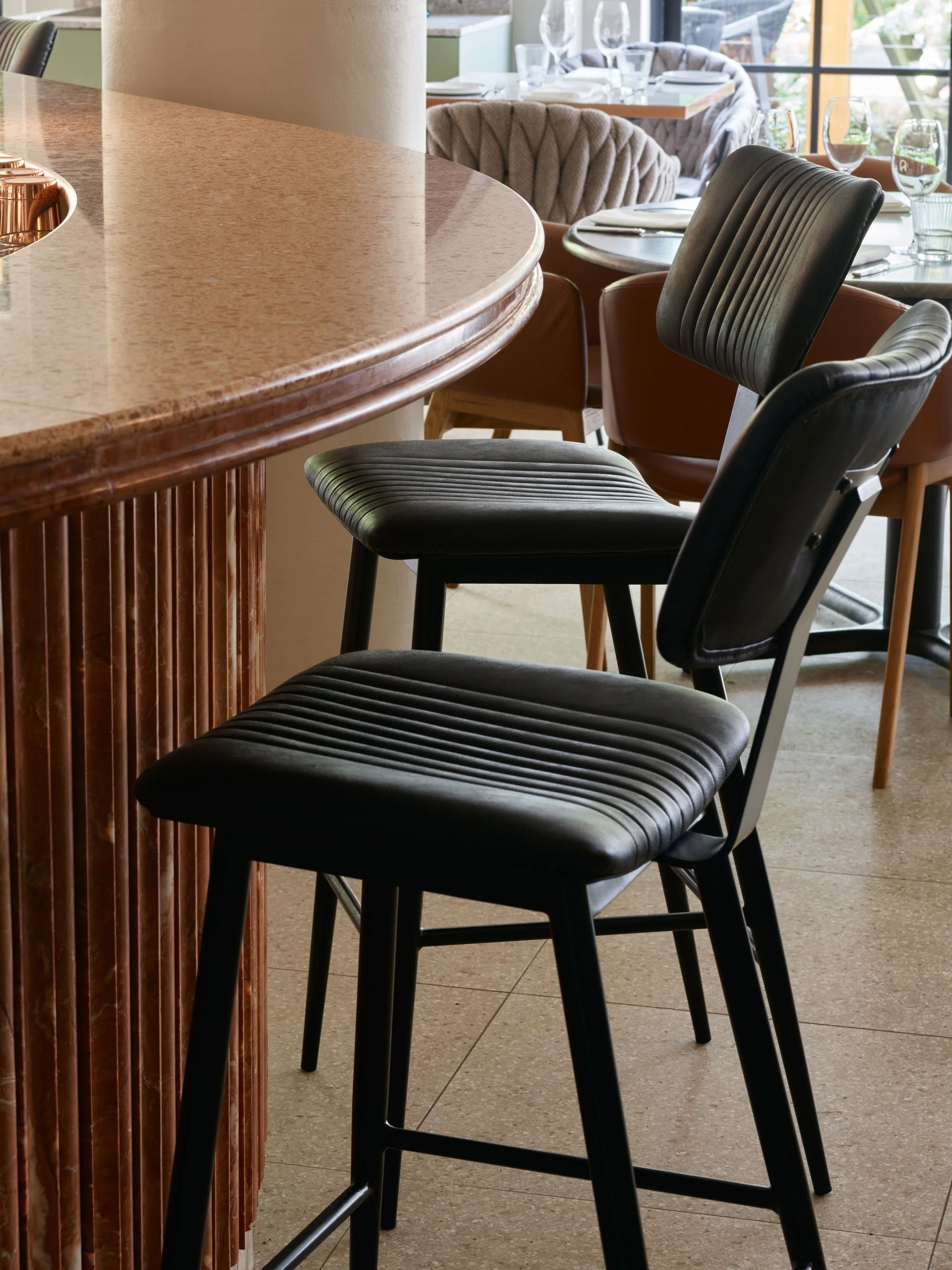
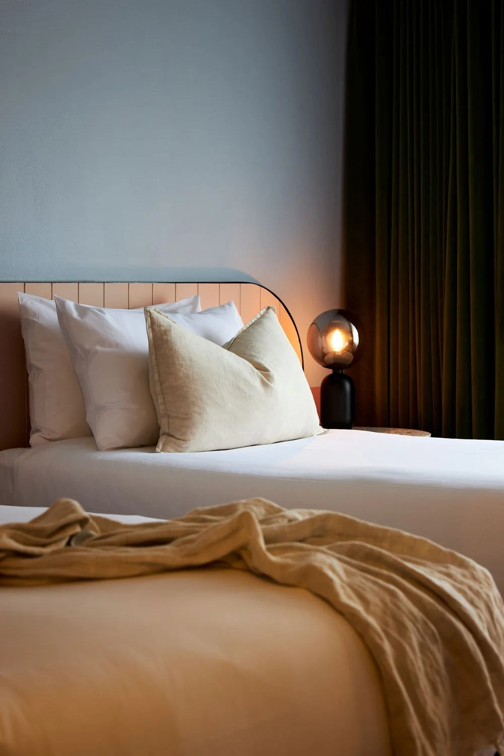
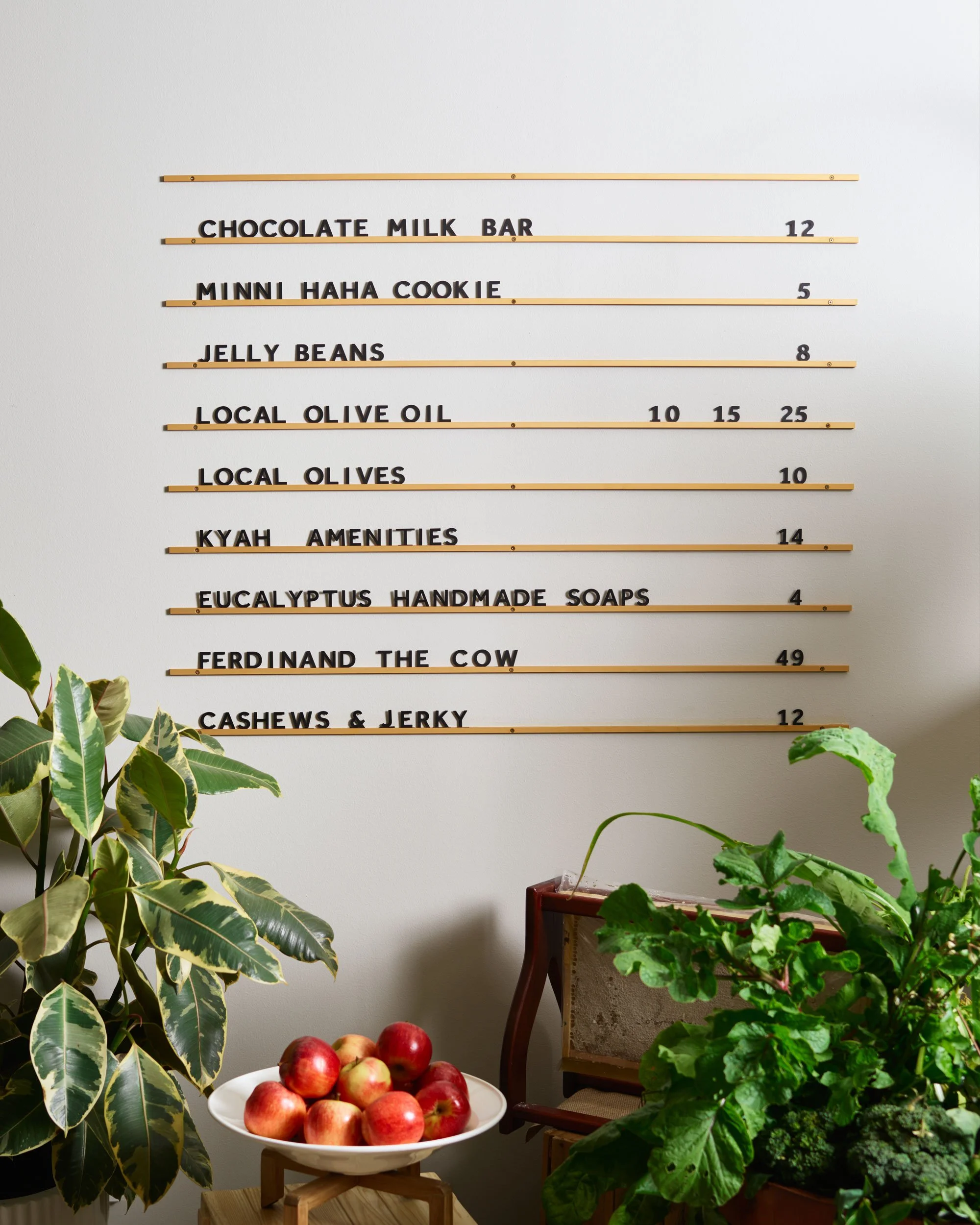
This idea of passage and transition carried through into content, shaping how the hotel is seen and felt beyond the logo. Imagery focused on moments of arrival, pause, and everyday rituals, capturing the warmth, ease, and understated glamour of the space.


DISCOVER MORE